Too many scary charts to reproduce. Plus, in all fairness, you really should read Mish’s latest economic analysis from the source.
Economy
Scary Chart of the Day – 12/06/10

This is scary if you think about it enough.
I debated whether or not this chart deserved to be a scary chart. Obviously I decided it was scary enough. Despite the lower cost of some stuff, deflation overall is not a good thing.
Economist’s View: FRBSF: Disinflation – It’s Not Just Housing
Scary Chart of the Day – 10/29/10
Calculated Risk: Housing Bust impacting Manager Mobility
One of the strengths of the U.S. labor market has been the flexibility associated with labor mobility at all levels of employment – households could easily move from one region to another for better employment. The sharp decline in house prices, leaving homeowners with significant negative equity, appears to be limiting this flexibility.
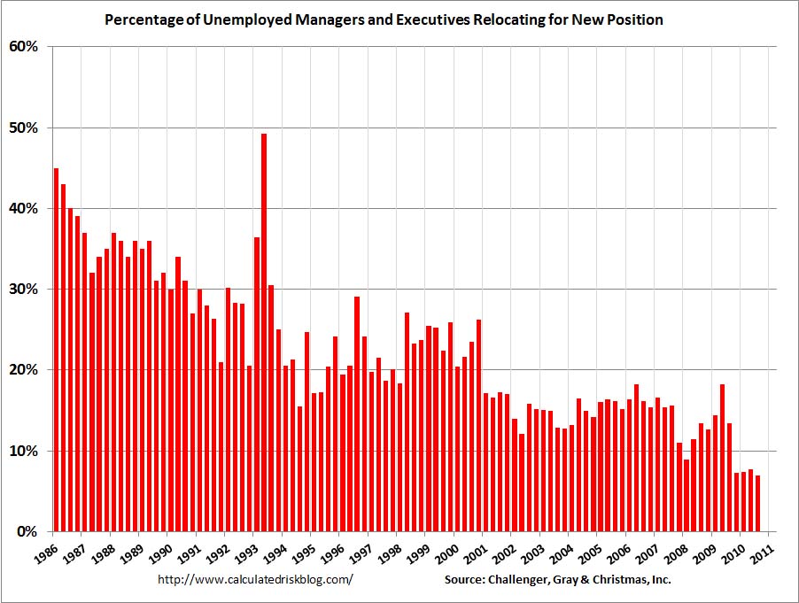
Bad times for moving companies
It’s Saturday morning and I’m not sufficiently caffeinated, sitting in my office catching up on the news when I come across this chart. So I get up and get another cup of Joe, sip and think a little more about just what this chart is telling me.
A lot.
Scary Charts of the Day – 09.20.2010
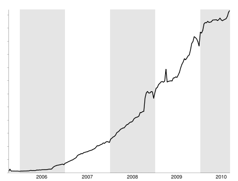
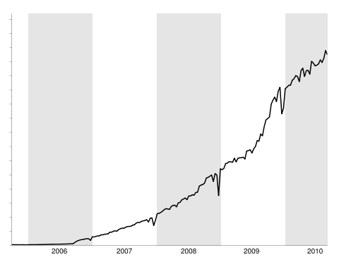
Official Google Reader Blog: A welcome and a look back
These charts should be extremely scary especially to folks in the newspaper and media businesses. If you wanted some hard evidence on consumer preferences for news outlets shifting to the Internet, here you go. The top chart is the number of people who use Google Reader at least once a week. The bottom chart is the number of items read on Google Reader.
Personally, we still buy a daily newspaper.
Fish Kill Update 09.18.2010
Guest Post: What’s Going On In The Gulf? « naked capitalism
Oil? What oil?
There are two links near the bottom of this article concerning possible human health consequences from the spill. We now know about the respiratory and possible cancer issues of 9/11 survivors and workers having inhaled lots of stuff. Pay attention to your Gulf Shore applicants for unusual rashes or symptoms.
The New US Economy
Lost Decade for American Income – WSJ.com
For your Scary Charts check out the article link below.
Or see what Yves Smith is writing about real estate.
Scary (or not) Chart of the Day – 09.02.10
EconomPic: Productivity Down… Is this Finally the Employment Bottom?
Click through and read the article. There is an interesting series of charts on productivity.
This chart may not be as scary as you might think.
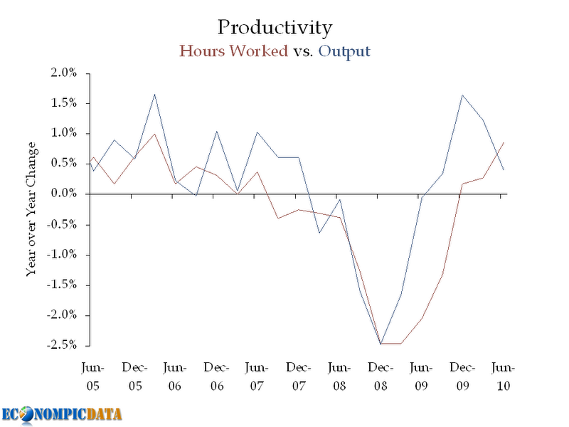
Scary or Not Scary?
Scary Chart of the Decade – 8.14.10
A Dynamic Equilibrium of Negative Consumption Externalities
Scary Charts of the Day – 6/25/10
Worst Home Sales Numbers Ever « naked capitalism
If you are not a regular reader of Yves Smith, you should be.
 lifeunderwriter.net
You must be logged in to post a comment.