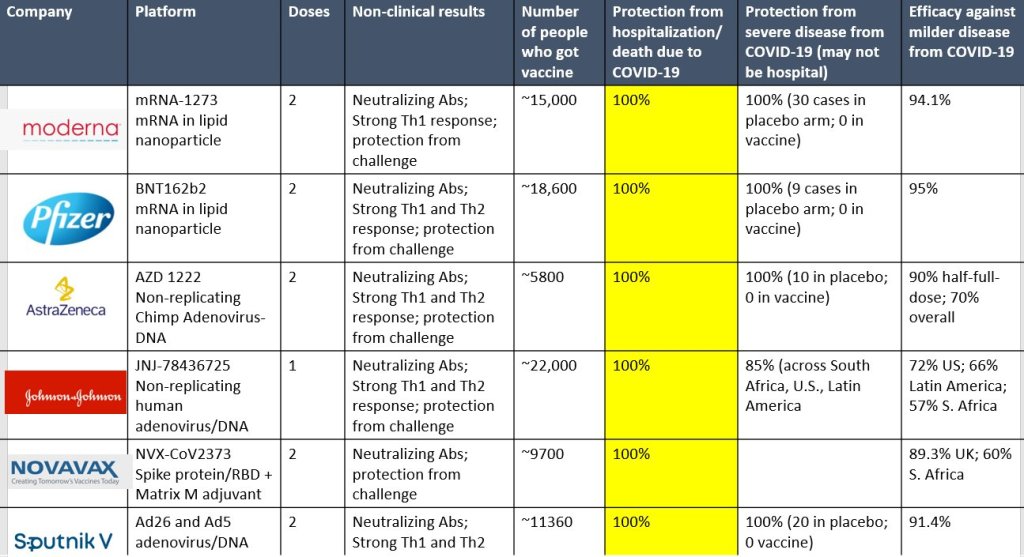
Doctors keep making cool graphics. I keep finding them. Note Column six from the left in yellow.

Monica Gandhi MD, MPH is Professor of Medicine and Associate Division Chief (Clinical Operations/ Education) of the Division of HIV, Infectious Diseases, and Global Medicine at UCSF/ San Francisco General Hospital. She also serves as the Director of the UCSF Center for AIDS Research (CFAR) and the Medical director of the HIV Clinic at SFGH (“Ward 86”). Dr. Gandhi completed her M.D. at Harvard Medical School and then came to UCSF in 1996 for residency training in Internal Medicine. After her residency, Dr. Gandhi completed a fellowship in Infectious Diseases and a postdoctoral fellowship at the Center for AIDS Prevention Studies, both at UCSF. She also obtained a Masters in Public Health from Berkeley in 2001 with a focus on Epidemiology and Biostatistics.
https://profiles.ucsf.edu/monica.gandhi
Wow, great info!
Hope it was OK to plagiarize to my site. Should I add credits?
Perfectly OK. It looks like you used the re-post button which automatically gives credit to the author. But since all you and I are doing is sharing another person’s work (credited on my post) AND we’re not doing this for profit it’s all good. We need more people to see, understand, and act on this information!
Oh good, that’s a relief. I actually didn’t know what that button was, and was playing around. But I’m glad it got shared. It is a great chart, and as you said we want more people to see, understand, and act on this info.