
Source: I’m in Awe of How Fast Brick-and-Mortar Retail is Melting Down | Wolf Street

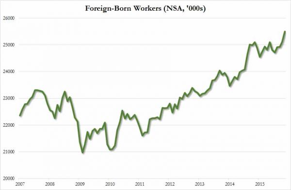 According to the BLS’ Household Survey, while 375,000 foreign-born workers found jobs in November, a whopping 326,000 native-born Americans lost theirs.
Interesting statistics. Just sayin’, you know?
Uneducated white Americans are living sicker and dying younger. Here’s why.
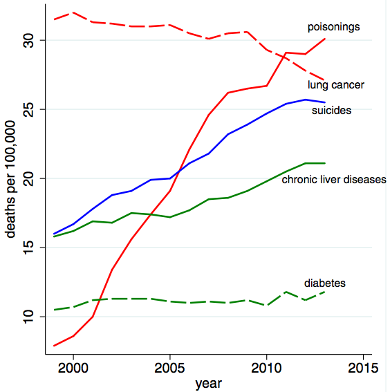
Source: The Despair Death of the Middle-Aged American – The Atlantic
MedPage Today link below.
One recent lawsuit involved a patient who suffered permanent kidney damage when he was given an antibiotic to treat what was thought to be an infection resulting in elevated creatinine levels. The patient was also suffering a uric kidney stone, which precludes the use of the antibiotic. Because of the complexity of the EHR, none of the attending physicians noticed the kidney stone.
Detracting from the EMR’s validity was the fact that a date related to a previous intravenous drip was repeated over and over on all 3,000 pages of the record.
While his physicians claimed they’d documented his care properly, the EMR was so complex and filled with repetitive data, the judge found it in inadmissible. “When an electronic medical record is printed out, the amount of repetitive data in it is ridiculous,” Klein said. “Attorneys are having conferences on how to attack EMRs.
“All these cases were from top vendors. We’re talking about well-established ones used at Kaiser [Permanente], at the VA… and academic institutions,” Klein continued. “These are not rare cases. These are common things.”
“We’ve seen 92-year-old women getting diagnosed as crack addicts because of drop down menus.”
via Lawyers smell blood in electronic medical records | Computerworld.
In my daily work I see more f**k ups in electronic medical records than I’ve seen my entire career. Et tu?

It has been quite some time since I posted a Scary Chart.
Boo.
JAMA Network | JAMA | The 2014 Ebola Outbreak.
The case fatality rate currently stands at 53% in this current outbreak.
Public opinion surveys consistently show pessimistic views of the economy for the broad mass of people. Growing numbers believe the Great Recession led to a permanent change in the economy, which is probably something less than true – with few exceptions, these wage and income trends have been consistent since the late 1970s. But the other questions in this Rutgers poll appear right on the mark. Almost eight in ten Americans knew somebody laid off between 2008-2012. For leading indicators like low unemployment, affordable higher education, and job and retirement security, the majority of Americans think they will never see positive progress for many years. Just 16 percent of respondents thought job and career opportunities would be better for the next generation, a figure nearly four times lower than from 1999.And we can chalk this up to the wisdom of crowds, because the public happens to be right. It is harder to get a job out of college. It is harder to avoid the trap of underemployment. It is harder to prosper in the career you want. It is harder to save amid stagnant wages. It is harder to grow as an economy when the gains flow to the top. It is harder to secure enough reserves for a dignified retirement.
Facts are facts and these are the facts.
The charts are ugly. But they tell us what we already know.
US income and wealth inequality facts of the day | FT Alphaville.
The Federal Reserve has just released its Survey of Consumer Finances for the year 2013.
These surveys occur every three years, so this is the first comprehensive update we have gotten about the distribution of income and wealth in the US since the economy hit bottom four years ago.
The most striking finding is that the median American family earned 5 per cent less in 2013 than in 2010 after inflation even though the average American family took home 4 per cent more.
“The job of the leader isn’t just to make decisions, it’s to make sense.”
John Seely Brown
The Scary Charts in Mish’s article paint a vivid picture of where this country and economy are headed. It’s not a pretty picture.



You must be logged in to post a comment.